 |
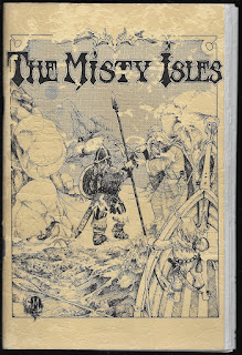
| The original cover dug up from the depths of Pinterest, because you deserve it. |
Lacking better option I have to go with the Pacesetter release again, which thankfully has no bland AD&D conversion this time. This doesn't mean the Pacesetter version is an exact reproduction of the originals: the maps were revamped, there are some reused illustrations, and a new cover nobody asked for. My mind boggles why we get is a cheap ass homage instead of the real deal - again. Heck, Bill Barsh even praises the original cover in the introduction! At least it could have been included in the book, but alas instead of preserving this historical piece of rpg art it was more important to waste an entire page for an orc, and for the fucking Vampire Queen again, who isn't even in the module. Give her a rest, please.
The Misty Isles wastes no time on bullshit. After a short guide about using the maps and an introduction we get a summary the nine islands, which then the book describes in more details one after another (frequently on a different name, to make things confusing). Each isle comes with a map of 21 hexes, and a few pages of entries explaining what each hex contains. There are only a few empty spots, which are usually areas covered by the sea anyway. The regions are full of encounters and adventure sites described in very dense, but straightforward manner. Monster and NPC stat blocks are embedded in the text, and aren't highlighted in any way, so good luck looking them up on the fly. Not that they would help much, at best you get hit points and armor type (not class!), other times just class and level. Most entries are related to the main conflict or theme of the land, and frequently the hexes are connected to each other, even if it isn't spelled out outright. Yeah, they weren't big on cross referencing back in the day either (although there are some examples).
 |
| If the overpowered local ruler wasn't enough, there are hexes of carnivorous unicorns and transforming wild cats. |
 |
| Well fuck you too. |
The way The Misty Isles approaches its regions is quite different from how the contemporary giant Wilderlands of High Fantasy does it with its dry charts and lists. It's also pretty deceptive. The entries in The Misty Isles might be wordier, but usually they don't carry more net valuable information than what you can decipher from the average Wilderlands of High Fantasy entry, and it's also harder to find relevant information in a chunk of text than in a table row. While far from perfect, I consider Wilderlands of High Fantasy to be a far more useful tool in running a hexcrawl with its technical style. One thing that The Misty Isles does better though, is being focused. While its regions are smaller, they all have an obvious overarching theme, which makes them easier to grasp for both Players and Referees.
The Misty Isles is a curious relic of the past. It's rough, it won't blow your mind, and there is a product from the same era that did at better job at what The Misty Isles attempted, but still, it's an interesting and entertaining snapshot from the era of low production values and high creativity. It has a heart and a vivid imagination behind it, and for that alone I recommend having it on your shelf, be it physical or virtual. Still, fuck you for the Island of Nonhumans...
Onward to Cha'alt...
Tl;dr: A forgotten attempt at sandbox campaigns that falters in presentation, but has some really good ideas.
Where to find it: You can find the module in print and pdf in the Pacesetter Games & Simulations webshop. Some of their modules are alse available on DriveThruRPG in pdf, so I wouldn't be surprised if the above mentioned three would surface there in the near future.
Other parts of the series:
Part I: Palace of the Vampire Queen
Part II: Dwarven Glory
Disclaimer: The DriveThruRPG links on this site are affiliate links. If you buy something through the link we'll get some credit for your purchase too.

